TLDR: The Wix Donations form has a selected state for its amount and frequency buttons, but no per-button setting for it. Whichever option is pre-selected in the editor is labelled "Selected", and the style you give that box becomes the selected look for every option in the group; the rest are labelled "Regular". Style the pre-selected box differently from the others and the problem goes away.
A charity client’s donate page had a Wix Donations form with the usual layout: One time or Monthly, then £10, £25 or Other. Clicking an option worked, and the button at the bottom updated to “Donate £25 Monthly”, but the option buttons themselves never changed. A donor had no way of seeing what they’d picked other than reading the Donate button.
The same question was posted in a Wix design Facebook group earlier this year (buttons can be selected, they don’t change colour, how do you show an active state?) with no answer, and comments on it have since been switched off. Wix’s own setup guide covers styling individual elements on the form but never mentions a selected state.
Where the selected style lives
This is the part the editor hides. Click into the frequency or amount options and you’d expect a Regular / Hover / Selected switcher on each one, the way most Wix elements work. There isn’t one. Instead the editor labels the boxes themselves: whichever option is pre-selected (set in the form’s Settings panel, where you choose the default frequency and amount) shows as “Frequency box (Selected)”, and every other option shows as “Frequency box (Regular)”. The amount options follow the same pattern.
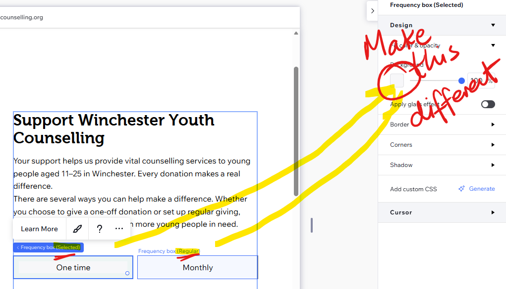
The style on that pre-selected box is the selected style for the whole group; the style on the regular boxes applies to everything else. When a donor clicks a different option, Wix swaps the two styles over. It makes sense once you see it, since only one option in a group can ever be selected, but nothing in the design panel tells you that’s how it works, and if the template has given both boxes the same look there’s nothing to give it away.
The fix is to click into the pre-selected frequency box (it can take a couple of clicks to get past the text to the box itself), give it a solid fill at full opacity and a contrasting text colour, then do the same on the pre-selected amount box. Leave the regular boxes plain. Preview the page, click through the options, and the highlight follows the selection.